Pages

Friday, September 30, 2011

Feel Good Flowers

Greetings to you all  from the evening of a beautiful sunny spring day here in the Antipodes.

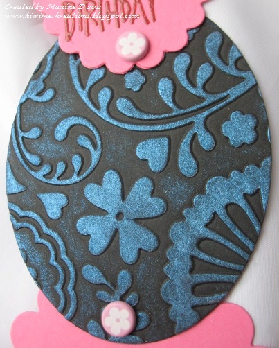
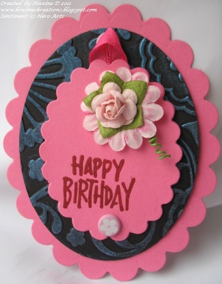
I have another friend who also has limited sight, so this is why this card is so bright and full of texture, so she can experience it with more than one sense.


I also went for strong contrasting colours in the hopes she can see some of it.

The green card is very bright IRL, and I ran it through the Cuttlebug in the Oriental Weave folder.


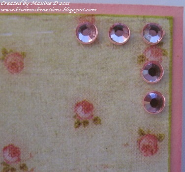
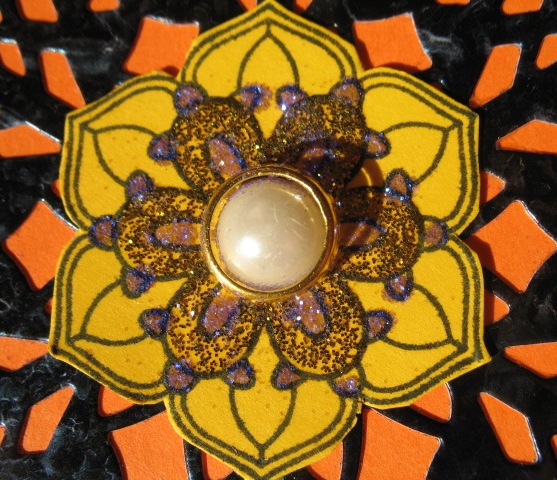
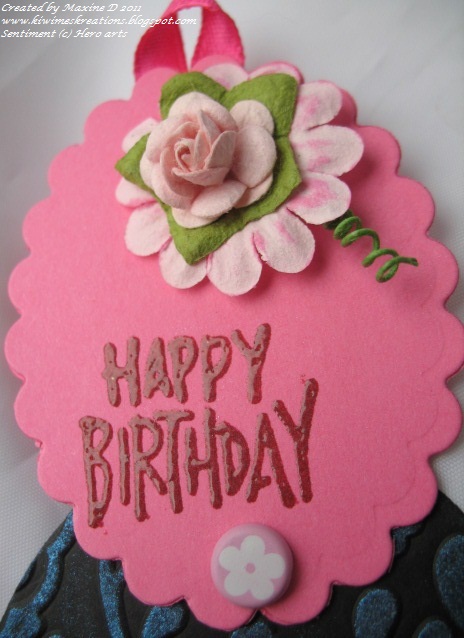
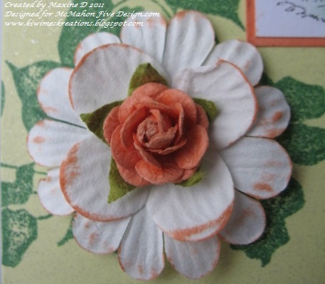
The flowers are some from a pack I bought this morning at the local Warehouse (similar to K Mart/Michaels), and to add to the contrast I layered them and place a Kaiser half pearl in the centres.  The curls are simply fine strips of dark green card rolled around a paint brush handle.


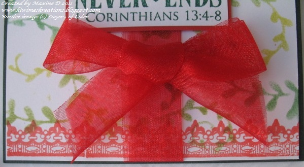
The sentiment was embossed in gold and double mounted, with the corners rounded to soften the appearance.

I am linking this to:


Thank you for visiting - may your day be blessed. 


Thursday, September 29, 2011

Lily Baby


Good Morning again, and welcome back.

This sweet new release from McMahon Five Design.com is from the Solocosmo  division.


I coloured the image with chalks before 'fussy cutting' it. 


There were some details that I used sparkle pens on - the scalloped edge to the wrap and bonnet, and the butterfly.


The image was mounted with foam dots on an oval cut from a lime coloured card which has a lovely discreet sparkle in it, and sponged with Memento Pear Tart ink.


The dp is from a Prima 6x6 stack, Romantique, which I ran the edges of over the Pear Tart ink pad, and was mounted on a pink card.


The lace was some from my stash, and I threaded a narrow pink ribbon through the pattern, adding a small bow each time it came through from the back.


Thank you once again for visiting.  May your day be blessed.

Baby Carriage

Greetings - you are most welcome, and I am so glad you visit my blog.

Today I must say that I am so glad I never had to push one of these!!


This delightful image is from today's releases by McMahon Vintage Digitals


It was coloured using a mix of mediums - sponged ink for the backgrounds, chalks, a gold pen and a Copic pen, Burnt Umber (my first attempt). 


The detail on the image is amazing - and great to work with.

The main image was mounted over a Spellbinders Paper Arts Scalloped Rectangle Nestabilitie, then onto some paper from the Prima Romantique 6x6 stack, which was sponged with Memento Desert Sand ink, then mounted onto a cream card, the edges of which was wiped along a Memento Dark Cocoa ink pad.


The bow is of a dotted chiffon ribbon, and was adhered with a glue dot and embellished with a pearl.


The sentiment is unknown and was stamped and gold embossed, and the whole finished with some Kaiser chino half pearls.

The rest of the design team has some wonderful work on display and I encourage you to visit them.

I am linking this to:

Thanks for visiting - may your day be blessed.

Tuesday, September 27, 2011

Bright and Beautiful

Welcome - I have been MIA for a few days as life was a bit fraught for a day or so, but has calmed down now, thankfully.

I wanted to make a card for a friend who has minimal sight, and this was the outcome.

I went for texture as well as contrast - the die cut is one I bought recently, called Italian Flourish by Cheery Lynn. I cut it out from glossy black card which I had spritzed with water and applied Opalite inks to. (Yes, the bottom of the die-cut was trimmed)


I then stamped the flower from the Simply Delightful stamp set on gold card, and the leaves from the same set with Bamboo Leaves ink onto white card and cut them out and placed them over the die cut.


I then added gold and purple glitter - the purple unfortunately looks very washed out here - and the pearl brad in the centre.


The sentiment is one of my original stamps from Kiwi Stamping. It was stamped and gold embossed and then the purple glitter applied - it shows a wee bit better here.

I am linking this to:

Thanks for calling by - may your day be blessed.


Thursday, September 22, 2011

Oh No!!

Welcome
This is my second post today - please scroll down for the other post.

This release from the McMahon Five Design team is released under the 
Studio 313 label and is named Funny Little Things.


There are three images and six sentiments in the set, which makes it very versatile.


The image was coloured with chalks and the edges sponged with Tea Stain distress inks.  The sentiment was printed separately, the edges sponged, and mounted over the base of the image.


The flowers are pre-cut from glittered card - they were a gift some time ago, and I do not know where they come from. The stalks were stamped and the 'wrapping' cut from a piece of wrapping paper! (Waste not, want not!).

The dp is from the Kaiser Le Chateau 6x6 pad, and run through the herringbone embossing folder, the edges were also sponged. 


After the dp and images were mounted, I gathered a length of stitched dark brown ribbon to form a flower, mounted this in the corner, using a glue dot, and added a gold rhinestone.


do pop over to the other design team members and see what they have created.


I am linking this to:


Southern Girls Challenge #28 - Anything goes
Truly Scrumptious Challenge #66 - clean and simple
Paper Shelter Challenge #32 - Anything goes
Fresh Brewed Designs - Challenge #65 - Keep it Simple
Digi Stamps 4 Joy Challenge #28 - Anything Goes
365 Challenge - Day 206 - Love, masculine style
Crafty Ribbon Challenge #2 - anything goes

Thanks for visiting today - may your day be blessed.

Baby in Lemon

Welcome again - I am so glad you have called in!

This weeks releases from McMahon Five Design  include this vintage baby image, Sweet Baby Mine.


The image was coloured using chalks, and cut using a Nestie classic oval die, embossed, and the background sponged before removing the die. 


The image had lace gathered around the oval, which was mounted with foam dots over some panels embossed with the buds and vines folder.


The same lace was placed across the base of the card and prettied up with some pale green rhinestones.  Rhinestones were also placed at the base of the image.


The final touch was this bow tied with a wee piece of silver edged, iridescent ribbon.


The other Design team members have also created some beautiful cards - do visit them - the links are in my side bar.


I am linking this to:
My Mum's Craft Shop challenge #24 - Boys and girls
The Paper Shelter Challenge #32 - Anything goes
Stampavic and More - Challenge #152 - Love (every baby brings their own)
Card patterns challenge # 133
Art Impressions challenge #33 - for the girls
Pals Paper Arts PPA112 -Element of style, Lace

Thank you so much for visiting - may your day be blessed.

Sunday, September 18, 2011

Interference florals

Welcome, and thanks for calling by.

I had fun recently taking a class on how to use Opalite inks - they are an interference ink, and I had owned a pad for some time and had not used to to it's full potential, so jumped at the opportunity to learn more.


This is one way of using them - I embossed the matte black card oval with the fantasy floral folder, then rubbed the Glacier Blue Opalite ink over it.  This does not really do justice to the sheen you can achieve with these inks.


I had seen this technique for a card online, and had also used it in the class. The originals used a circle, but as I don't have circular Nesties, I used oval instead.

This is a close-up of the smallest oval, with the sentiment stamped in Memento Pearlescent Poppy ink and embossed with clear embossing powder.


And here is the card opened up - it pivots on the floral brads you can see at the base of the top layer, and there is one base of the central panel.


I am linking this to:

Thanks so much for visiting - may your day be blessed


Thursday, September 15, 2011

Bookworm and Petal Plucker

So do I have your attention with the title? I find I have to be careful with titles or the spammers have a ball...

My first card today uses an image that I can relate well to - a lass with her nose in a book - a constant for me when I was young.


This image is being released this week by McMahon Vintage under the title of Story Time.  I coloured the image with chalks, a soft mauve, although the camera shows it as blue, and pink.


The image was then mounted on a soft lime green card, which picked up one of the colours from the Prima Fairy Flora  design paper.

This was mounted on a doily cut (with a newly purchased die at a local Craft Fair last week) from a very pale mauve card stock.

The purple chiffon ribbon was some from my stash, and threaded through a buckle that adheres to the card.


The tassel I made from four shades of purple embroidery floss, which was then 'combed' with a needle to separate the strands to give a softer appearance.
The wee butterfly was another recent purchase.

The  second release this week is also from McMahon Vintage and is titled Mary Mary.


Again the image is coloured with chalks, with orange being the predominant colour used, and then mounted on a layer of soft orange card.


The base is a gentle lime green with a very subtle sparkle in it.  I stamped it with an Hero Arts stamp, Ivy Leaves, using Memento Cottage Ivy Ink.  


Where the images crossed, I placed a flower made with two white paper flowers wiped over a Whisper Orange ink pad, and then a Prima Fairy Rose mounted in the centre of those.

The card was finished with some piercing in the top corner.

Thanks for calling by - May your day be blessed.

Sunday, September 11, 2011

Layers of Color Love.

Just a quick post today with a card made entirely with Layers of Color products, well the stamps and stencil, anyway.


The background was stenciled using the Botanical Swirls Art stencil and three inks - the Memento Cottage Ivy, Bamboo leaves and Pear Tart.  The border at the base was stamped using an element from the Artful Endearments Stamp set

The feature panel is a single stamp from the Love Chapter set, stamped in Adirondack Bottle ink, mounted on some red card.  


The red chiffon ribbon was doubled before being layered over the base panel and the Love panel mounted with foam dots over that again.

A bow was tied and adhered and the card complete.


I am linking this to:


Thanks for calling by - may your day be blessed.

Friday, September 9, 2011

Oh Deer!

Yes it is 'Oh Dear'!! Due to family commitments I am somewhat late in posting this, thankfully Sue, the owner of McMahon Five Design is very understanding and agrees that family is most important.


The image and sentiment are from a new set by Studio 313, called Dearest Deer.  I used the title sentiment, mounted it on a red base and added a couple of 'puffed' hearts (origin unknown).


The wee patchwork deer was painted using watercolour crayons, and mounted on the red scalloped oval by Spellbinders.  


The hearts on the rump of the deer were given added accent with some dimensional glue.

Kindy glitz was used to add sparkle to the deer and to the scallops.


The scalloped oval and sentiment were mounted on a light brown card that had been embossed with the branches folder by provo craft, sponged with tea stain distress ink, and mounted onto the red base card.

I am linking this to:

Thank you for visiting - May your day be blessed


Friday, September 2, 2011

Antiquated Car

A warm welcome to you all - I am so pleased to have you visit.


I needed a masculine card and I did not have a lot of time, so I reverted to a digi image from the Clearly Vintage blog, of an antique car advertisement for the background. This was printed onto copy paper and mounted on dark brown card.


I then wanted a sentiment to match, and used this greeting from the Layers of Color Happy Wishes clear stamp set.  The sentiment was stamped using Adirondack Espresso ink on white card, this was trimmed, mounted on dark brown card stock and mounted on the base using brads.

Brads were also placed at the corners of the main layer and the whole mounted onto Kraft card stock.

Quick, simple and very effective.

I am linking this to:
Thank you for visiting - May your day be blessed.

Thursday, September 1, 2011

Fall Phrases - a Sympathy Card

Welcome to my blog and to the latest releases from McMahon Five Design.com.
Today I have chosen to showcase the Fall Phases set from  Studio 313, and an extremely versatile set this is!! 


There are many sentiments and various other elements that make using this set a breeze.  


I chose to pair the sympathy sentiment with the tulip flower, and printed them directly on the design paper for a more subtle effect.  


 The paper is from the Prima Fairy Florals 6x6 stack, which was mounted onto a mid-green card.


To finish the card I simply added some lace and two rows of champagne border pearls.

Here is a sample of the full set of sentiments and images .


Please visit the other members of the Design Team (listed on my right sidebar) to see the beauty created by them with the new releases.


I am linking this to:
Creative Card Crew - Anything Goes 
I Break For challenges - challenge #8 - Shabby Chic
Top Tip Tuesday - Challenge #49 - Shabby chic

Thanks for visiting today - May your day be blessed