Pages

Wednesday, April 27, 2011

Change of direction

A warm hello to all my visitors.

I made this card a week or so ago, and I don't remember what the original recipe was that I was working to, but I do know what I made was totally different and was not 'eligible' for the challenge I had in mind when I started!

I guess a few of you would identify with that?

This is the result

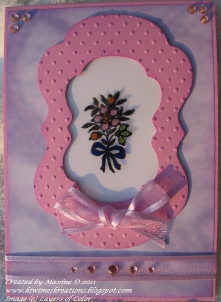
I started by running an embossed line approximately 8mm inside  the edge of the card.
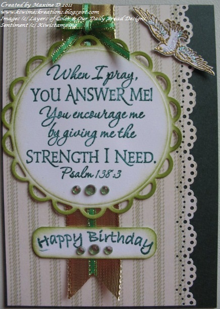
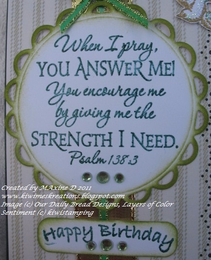
I then stamped the the Layers of Color greeting from the Happy Wishes clear stamp set, and the large flourish from the Stampin' Up Baroque Motifs set in Tsudineko Pearlescent Lavender ink.

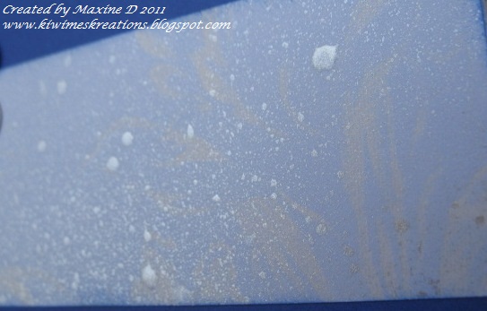
I then tried stamping the large motif in red Staz On ink on acetate to layer over it, but lets just say it did not work.....

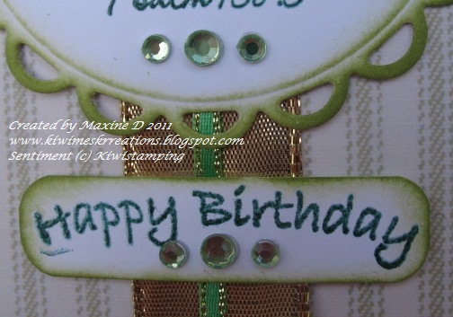
So I did a fast re-think, and added the ribbon and pearls and called it quits - since then the card has grown on me and I am quite happy with it now.

I am linking this to:


Thanks for calling by - I really appreciate your visits, and comments when you leave them.
May your day be blessed.

Saturday, April 23, 2011

Gold butterfly

Good afternoon, and  Easter blessings to you all. 
 I thought I had better put this entry up before the challenges I had in mind when I made it, expire.


The sketch I used is the current Midnight Madness sketch challenge 100

I used the Bell Brocade art stencil from Layers of Color for the design on the panel to the right, sponging on Ranger Stampit wine ink.
The rectangle was cut from a pale pink paper and sponged with lavender ink  (of the same brand) before being taken out of the Spellbinders Classic rectangle (lg #3) die.  This was layered on the matching Scalloped rectangle cut in pink. 

Before adhering this to the cream speckled card base, I cut three loop edged squares from the Cuttlebug vintage corners dies in olive green paper.
I split one in half diagonally, and laced that and the two intact ones together with the ribbon and bow before adhering to the base.  The remaining triangle was placed in the bottom right corner with another bow on it.


The butterfly is from the Joyful Noise stamp set by layer of Color, stamped onto the green paper and embossed with gold ep, and painted with twinkling H2O's.  I used Iridescent Gold on the wings, which gives a wonderful interplay with the light. 


The butterfly was mounted on dimensional adhesive, and pink rhinestones placed for the 'flight path'


I am linking this to:

Thank you for visiting, and may you know the richest of Easter Blessings.

Wednesday, April 20, 2011

Framed - in pink!!

Yes, a second post in as many days!! 
Welcome back, and thank you for visiting. 
I have made various cards recently with specific challenges in mind, and have not posted them in time, hence this post.
The challenge that this has been made for is over at Lily Pad Cards, and is the dimensional challenge.

  For the first time, I have made a frame using two Labels 14 Spellbinders dies,  then ran it through the Cuttlebug Swiss Dots folder and sponged the edges with Whispers Plum ink.

Next I cut a matching piece of acetate, and stamped an image from the Granny's Jewellery  stamp set by Layers of Color in Staz On ink.  On an identical piece of white card I stamped the same image again.

The back of the acetate was painted with twinkling H2Os, and also the ribbon on the card image.  The flowers on the paper copy had rhinestones added for colour, which adds a real depth to the colours.


The frame was mounted on the card base, which had a piece of marbled mauve dp on it, using foam mounting dots.

The final details were pale mauve ribbon and pink rhinestones.

I am linking this to:

Thanks for visiting - May your day be blessed

Tuesday, April 19, 2011

Blue sympathy

Hello to my visitors - it is great to see you here again :-)

I needed a sympathy card for a man (and his wife) in our church the other day, and this is  the result.

I kept it very simple - the strip of paper in the centre of the card is some dp that I sprayed with silver paint a while ago, and this is an off cut.  The dp itself is a pale blue with a cream flourish on it.  I used some blue ink to sponge the edges with.


I used the same blue ink (Tsukineko Brilliance Mediterranean Blue) to stamp the sentiment (ODBD with Heartfelt Sympathy set) and emboss it.
This was then cut with a Spellbinders Lacy circle die, embossed and sponged with more of the same blue ink.

The card was then assembled and some pearls added.  All done in less than an hour - quite a record for me!!

I am linking this to:

Thanks for calling in - I always appreciate your visits.
May your day be blessed

Friday, April 15, 2011

Orange Butterfly

Greetings - it is nearly two weeks since last I posted - life just seems to have got in the way!!
Today I managed two cards, and I am posting this one as the person it is for does not read my blog so I am 'safe'.

I was inspired by Card Patterns Sketch 110, and this is the result.

The pink paper has a sheen on it, which IRL makes it really pretty.  I punched the border with a Martha Stewart punch, which seemed to set the theme of dotted curves.

The brown dp is some from a 'scrap pack' I was given,  the gold dots are embossed, making it a delight to work with. I am using it sparingly as there is only one small piece.  (Others call it hoarding!!)

The lace across the bottom is some tatting I did years ago and never used.... I threaded some gold ribbon through it for this card.

At one end I threaded a buckle through, and glued a really dimensional button on for a focal point... this came from my button jar which has buttons from both my mother and mother in law.

The butterfly I stamped and embossed with copper embossing powder on pale orange vellum - it is my original butterfly stamp from Kiwi Stamping, and for years has been my 'go to' butterfly stamp.  


I painted a few of the features and body with twinkling H2O's and used dimensional adhesives to mount it onto a spellbinders dotted circle cut from gold paper.  

I am linking this to the following challenges:

Thanks for calling by, I love seeing that you have visited.
May you day be blessed.


Monday, April 4, 2011

Green, green, and green again

Greetings to all my visitors - it is great to have you visit me again.

The title of this post comes from the fact that the person I have made this card for loves green, so that is the over riding colour in it, in various shades.

The base card is bottle green, and the striped paper a soft green with an undertone of grey, {which the camera seems to have picked up :-( }, the edge of which was punched with the Martha Stewart doily punch

The main scripture stamp is from the Our Daily Bread Designs Scripture Collection 2, the sentiment from kiwistamping, the local firm who got me hooked on stamping when I was most cynical!!

They were both stamped with Versamark and Adirondack Bottle inks and clear embossed.


The main image was cut and embossed using a Spellbinders lacy circle, then sponged with Memento Bamboo Leaves ink.  The sentiment I simply cut out as a rectangle, and then used a punch to round the corners. 


The bird is from the Layers of Color Royal Bird clear art set, gold embossed and highlighted with a wee dab of Crystal Kindy Glitz.

I layered a gold ribbon in the center of the dp, with a narrow green and gold ribbon centered on that again, and mounted the rest of the elements using  shallow foam adhesive dots, and added some green rhinestones for a little glamour.


  This final photo will show some of the dimension.

I am linking this to:

Thank you for visiting - may your day be blessed.


Saturday, April 2, 2011

Black and Silver

Greetings again - it is always great to know you have visited.

I needed to make a quick card the other day to go with a gift that was very late in being posted!!  The gift was packaged in a wee black box, which I had tied a silver/white ribbon around, which is what inspired the colour choice for the card.


The base is black - from my stash of card-stock that I bought from a local printer. I found I had only a sliver of silver shim left, so halved it to create a border for the white pearlised card, which I embossed with the Textile Texture folder by Cuttlebug.

This photo gives some idea of the sheen on the card.

The Dragonfly is a digi stamp from Priscillastyles Store - I love it, and enjoy just how versatile digi's can be.  It was printed it twice and just the wings  layered to give added dimension after painting it with iridescent blue Twinkling H2O paint


Don't you just love the detail on these wings!!

The card was finished with the sentiment silver embossed and the clear rhinestones added.  I must confess that after all the photographs were taken, I added three tiny rhinestones to the body of the dragonfly.

I am very happy with this result - I never thought even a couple of years ago that I would ever make a black card, but things change!!

I have used this layout on several cards recently and love how versatile it is.

I am linking this too :

Thanks for calling.  May your day be blessed!!